analysis
Reviewing Steep - Aligning your company on the numbers that matter
If you dig down, every company has a set of core metrics, and north-stars. Even if they don’t call them as such. Some organisations might even have clear KPIs and OKRs. But what most don’t have, is a tool that charts them all in one place and empowers all users to view and dig deeper on them — not just the ones with technical knowhow.
Steep is BI tool that does just that - and in this quite compelling BI landscape we’d wanted to sketch out how we use it.
It has a focus on defining metrics & measurements above all else - and it enforces definitions across the business. It means you have to decide for once and for all what your company actually means by New Subscriptions or MAU (or any other metric). That’s good!
This is orchestrated through Steep’s Metric Catalogue, which nicely organises metrics into different Categories for easier identification of the right metrics for the question at hand (e.g. someone looking for how many new subscriptions were started last month could expect to find that within the ‘Subscriptions’ category).
On top of that, Steep provides great functionality for controlling who can view each metric through its use of Teams. Metrics can be assigned to only certain Teams (or made accessible to the entire company). And these Teams can also be set as private to create a curated homepage for a subset of users whenever they open Steep (which could be in web browser, a dedicated Mac app, or App Store / Google Play apps).
In this post, we’ll show you how you can leverage Steep’s metric-first approach to BI (using our own internal analytics around client delivery as an example), providing a nice development framework.
Core concepts
By now we’ve made it pretty clear how important metrics are in Steep, but they are enhanced even further by other powerful concepts:
- Metrics - the centre of everything you want to do in Steep, defined up-front and become the primary starting point for any user looking for an answer to a question… it’s Steep’s version of a semantic layer
- Reports - dashboard-meets-document, these powerful note-taking-style documents combine visuals and commentary to create compelling narratives around your metrics
- Teams - provide a structured, curated set of metrics and reports that showcase the things that matter most to each team
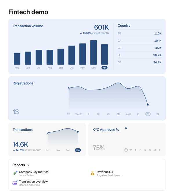
- Homepage - the headline metric numbers that are most important to the company, front-and-centre every time Steep is opened (and Teams get their own homepage’s as well!)
Metrics, metrics, metrics
There is nowhere else to start. Metrics are everything in Steep. The initial setup is very much like every other BI tool (setting up the necessary connections and permissions to the data warehouse), but that’s where the similarities stop.
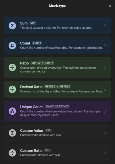
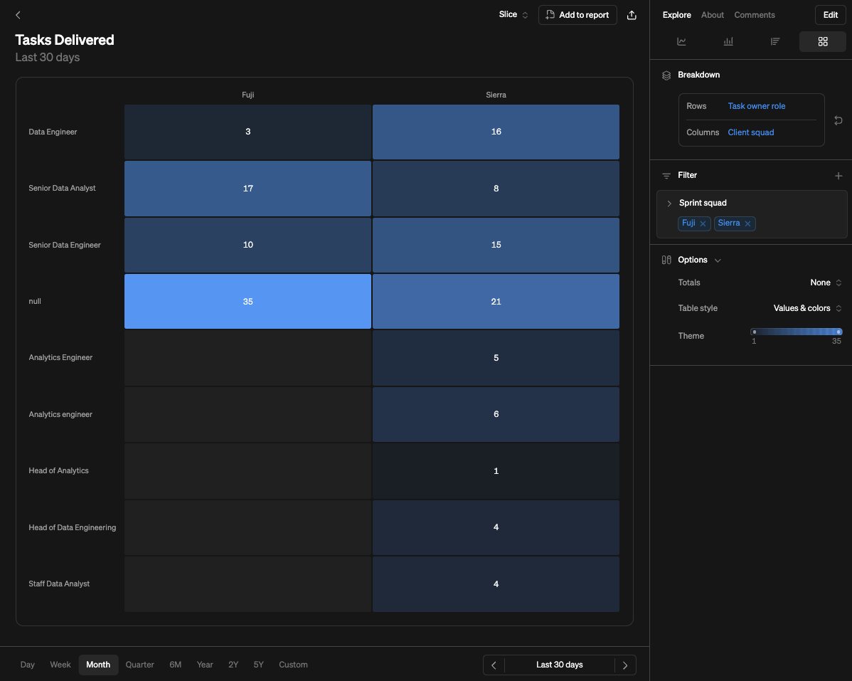
Once connected, each metric is individually created from any available table. Your Value is your metric, which is primarily a numeric field from the table in question, but Steep enables a number of aggregation types.
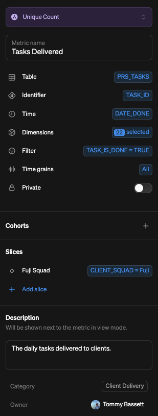
Each metric is then fully structured to provide end users with all the tools they need to self-serve any questions they might have. You'd have the ability then to
- enable only certain
dimensionsbe displayed or broken down by a metric - or the fact that a single
timefield has to be used (which is great for ensuring a metric isn’t plotted against an unrelated timeframe)- however its worth noting that you have to plot and/or filter your
metricby your chosentime, which while usually what you’d want to do, can be a little restrictive in certain situations
- however its worth noting that you have to plot and/or filter your
- or the ability to assign applicable
time grains - or create
slicesto provide users with pre-filtered versions.
All those features provide a level of governance that could otherwise be missed. In particular, the ability to mark metric as private works seamlessly as when included within a report it will only populate to those who have been granted access to it.
And just like that, we have our metric. It is now accessible in our metric catalogue, enabling anyone to jump in and explore. The visual options aren’t as extensive as other BI tools (so if you’re looking for an extensive selection this isn’t for you), but the streamlined set provides simplicity that helps focus on the core insights that can be derived from changes in a metric.
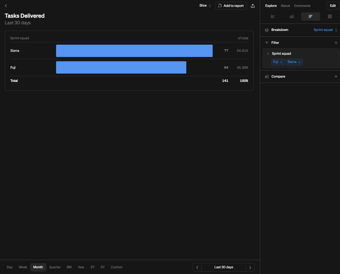

And once that exploration has uncovered something that needs sharing more widely, it can be added to a report (new or existing) with ease.
metric is perhaps more time consuming as it’s an extra step compared to some other BI tools. However, doing this properly upfront ensures focus and consideration has been given to what metrics are made available (as opposed to everything being there). So we think it’s a good feature.Reports
Reports in Steep are a hybrid between a dashboard and a document, providing flexibility to structure a narrative for the metrics and allowing collaboration across users.
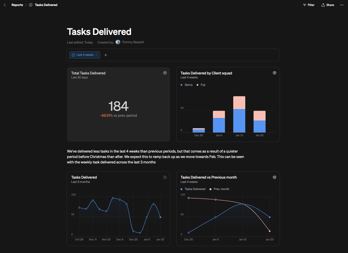
Additional visuals become available here as well, so the ability to showcase as big numbers or a table provide further direct to reports message (on top of the set we’ve already showcased).
Teams
Every company will be made up of different departments, functions, whatever other name you want to give them. In Steep you can tailor to their specific needs using teams. And with the ability to mark teams as private, you can ensure sensitive information is not put in front of the wrong audiences. You can also mark individual metrics as private for certain teams to really control what is accessible (and that privacy continues into the reports as well).
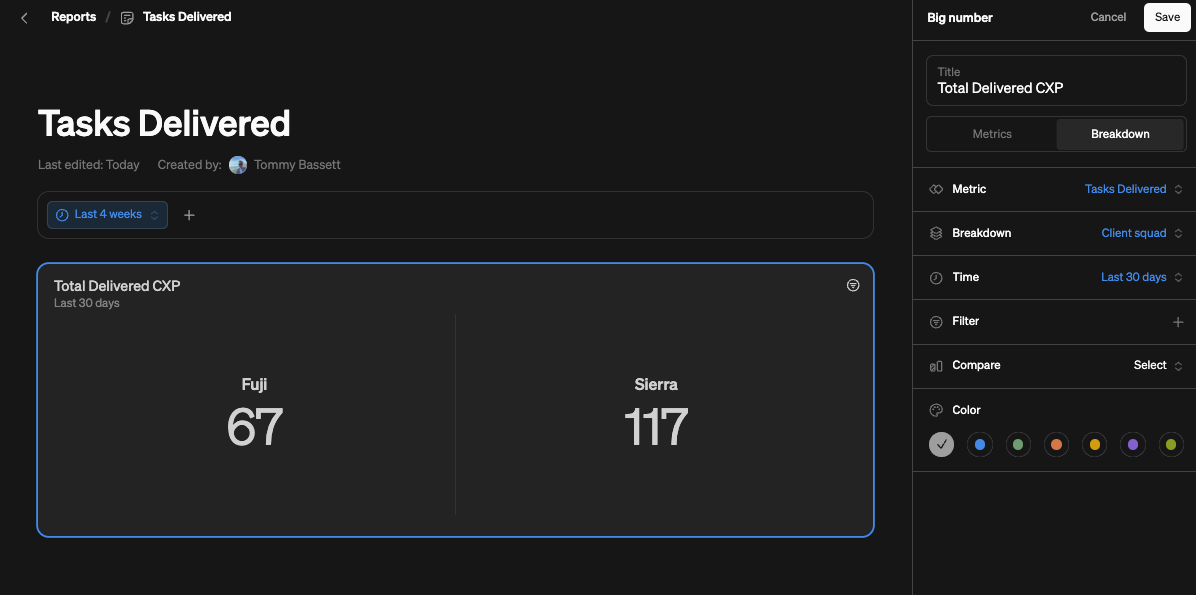
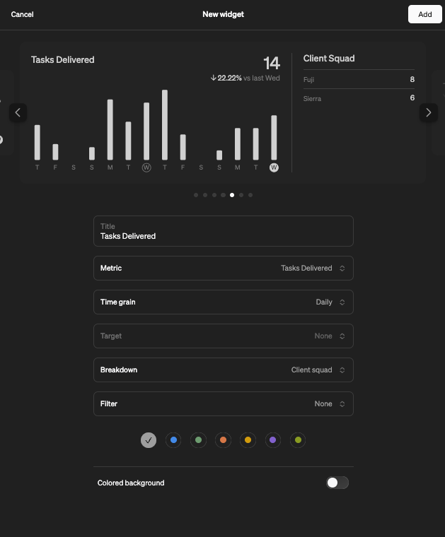
Teams also unlock addition widget visualisation options that succinctly display how a metric is performing. We’ve got included them all here, but you have the power to include breakdowns by a dimension, filter or some comparison vs a target.
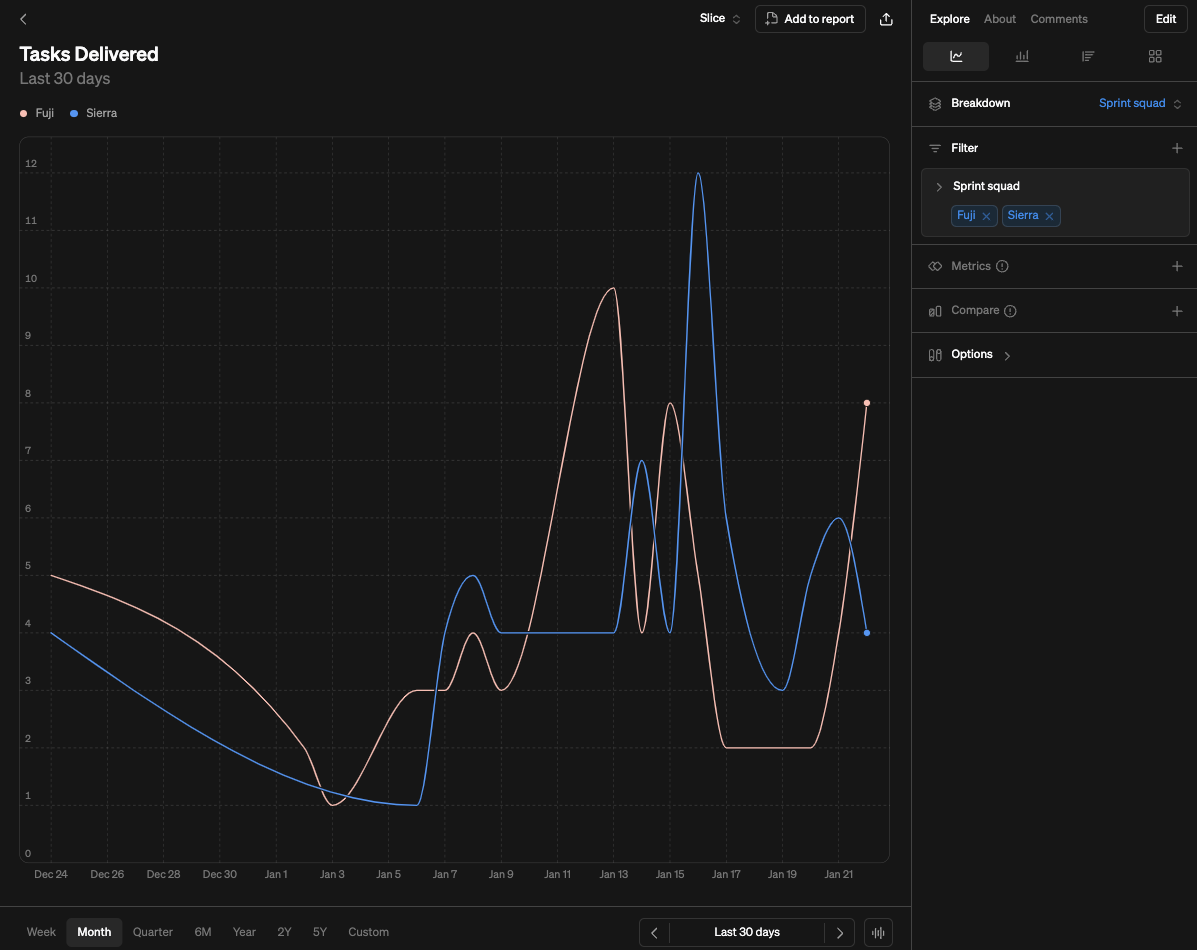
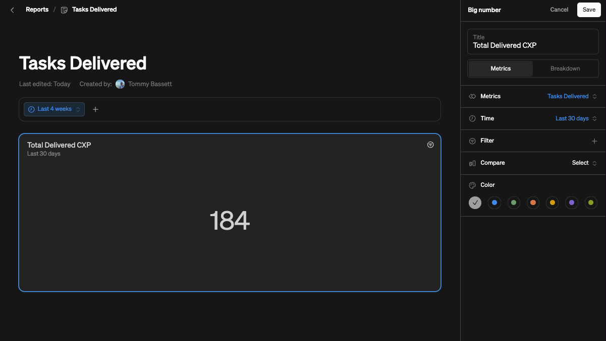
Teams, be they private or open, are then available as focused views within the UI that help to bring to life key metrics across a similar area. Right now we’ve only got our CXP Delivered metric to showcase this with, but just image how you can begin to surface all a department’s core metrics so its front-and-centre every time they open Steep?!
(Incidentally - Steep told us that reports shared with the entire company can always be seen on the home screen, and that if it’s shared with a team, it will pop up in their team space. You can also pin them so they’re always on top!)

Homepage
The homepage in Steep can be thought of as a team for everyone. You create your widget visualisations in the exact same way. The beauty of the homepage comes from the ability to really focus the entire company on the metrics that matter. And whether that metric is first seen on the homepage, within a team or report, or within the metric catalgie, the user has full ability to explore it further, freely with the confidence that everyone is starting from the same definition.
Depending the teams you are in, and which are or aren’t private, the homepage can result in a different experience for each user. In our example here, we are:
- showcasing weekly ‘CXP Delivered’ to everyone in the company at the top of the
homepage - enabling everyone to see the ‘Client Delivery’
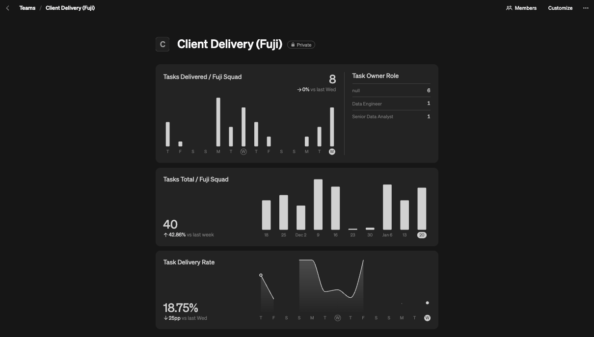
team, which has awidgetshowing that same ‘CXP Delivered’metricalso split by squad - a private
team(as we’re admins and/or part of thatteam) that has aslicesmetric for ‘CXP Delivered’ for our one of our squads.
Implementing Steep across your company
Here we’ve only showcased the creation of a small handful of metrics, a single report and a couple of team, but in reality there will be significantly more of each. It is therefore important to have a clear idea of:
- The most important / relevant
metricsto begin integrating into Steep - How those metrics are owned / shared across different
teams(as well as any metrics that need a level of privacy assigning to them)
From here, you’ll be well placed to begin creating reports, customising the homepage with the key metrics for everyone, and curated team homepages with specific content.
There are other very cool features like targets (which are linked directly to your individual metrics to enable quick insights into performance vs expectations) and entities (enabling user to drill-down into the data) that we haven’t even touch on! You can learn about all of Steep’s features here. Have fun!
More articles
analysis
analysis
Fixes for Mobile Attribution in 2024
advice
advice
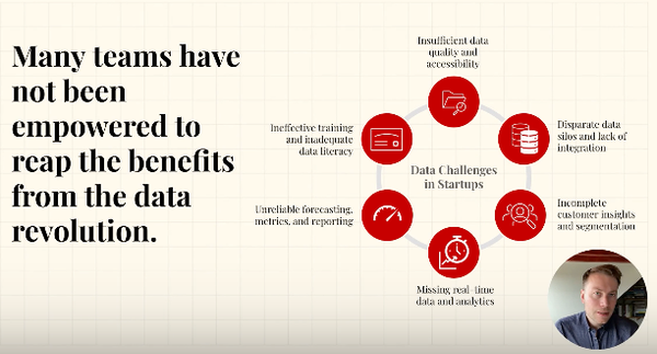
Effective Data Teams: 6 Key Challenges for Businesses
Invested a lot in data over the years? But struggling to see results? You’re not alone. Let’s make this more concrete and talk about six key problems most data teams face — and what you can do about them.