Maximize BI Efficiency with Omni’s Three-Layer Model

We’ve been saying for a while that BI & Analytics tools are a super exciting space at this point. AI is redefining how we interact with data, and there are a lot of players out there trying to crack the challenge of proper self-serve analytics.
Until now, the choice was between either a very regimented approach (build a deep semantic layer and spend a lot of time designing explores, giving business users a nicely curated experience) or a free-for-all natural language approach more suited to notebooks and deep analysis.
Omni combines both approaches. We love this.
A quick demo of Omni by our co-founder Thomas in't Veld
They got started in earnest last year, with a team formerly from Looker (which really set the standard in how semantic layer BI tools should work). And that experience has paid off.
Omni stands out with its a three-layer modeling approach. At Tasman, we’ve embraced this powerful platform to streamline our DDA (Dashboards driven analysis) and ADD (Analysis driven dashboards) approaches to develop analysis.
So, in this post, let’s dive into how we leverage Omni’s unique features to deliver our analytics for our ambitious clients (and our internal analytics).
The Three-Layer Model
Omni’s architecture is built on three key layers:
Schema Model: This mirrors the database structure, so end users are not necesarily engaging with this layerShared Model: This contains global business metrics and definitions which cascade down to workbooks and queriesWorkbook Model: This facilitates ad hoc analysis and custom metrics, and supports Dashboards.
This layered approach allows for a flexible yet structured development process. This ensures consistency across our projects while allowing for customisation where needed.
Our Development Framework – Step-by-Step
Step 1: Setting the Stage
We typically start by integrating Omni with the client’s data warehouse, setting up the necessary connections and permissions. This foundational step ensures smooth data flow and sets the stage for efficient development.
In this example, we’ve set up our Snowplow account with our Beacon data. We use this on a daily basis to assess client delivery speed and optimise our resources.
Step 2: Creating Topics in the Shared Model
Next we have two options. We either follow our best domain layer design (which consists of source, staging, domain and presentation), where we only expose the presentation layer to the end user. This layer contains a number of highly curated use cases.
We do this by creating a topic within the IDE Shared model :

This step is crucial for establishing a consistent, organisation-wide understanding of key metrics and dimensions. Because we have been testing this dataset in other BI tools, this is our preferred option.
Or, we follow a second option — one that gives the analyst more freedom in the tool. Here we would join the relevant tables together by setting up the right joins and relationships between them in the semantic layer. This then creates a topic later on.
Step 3: Initiating Analysis
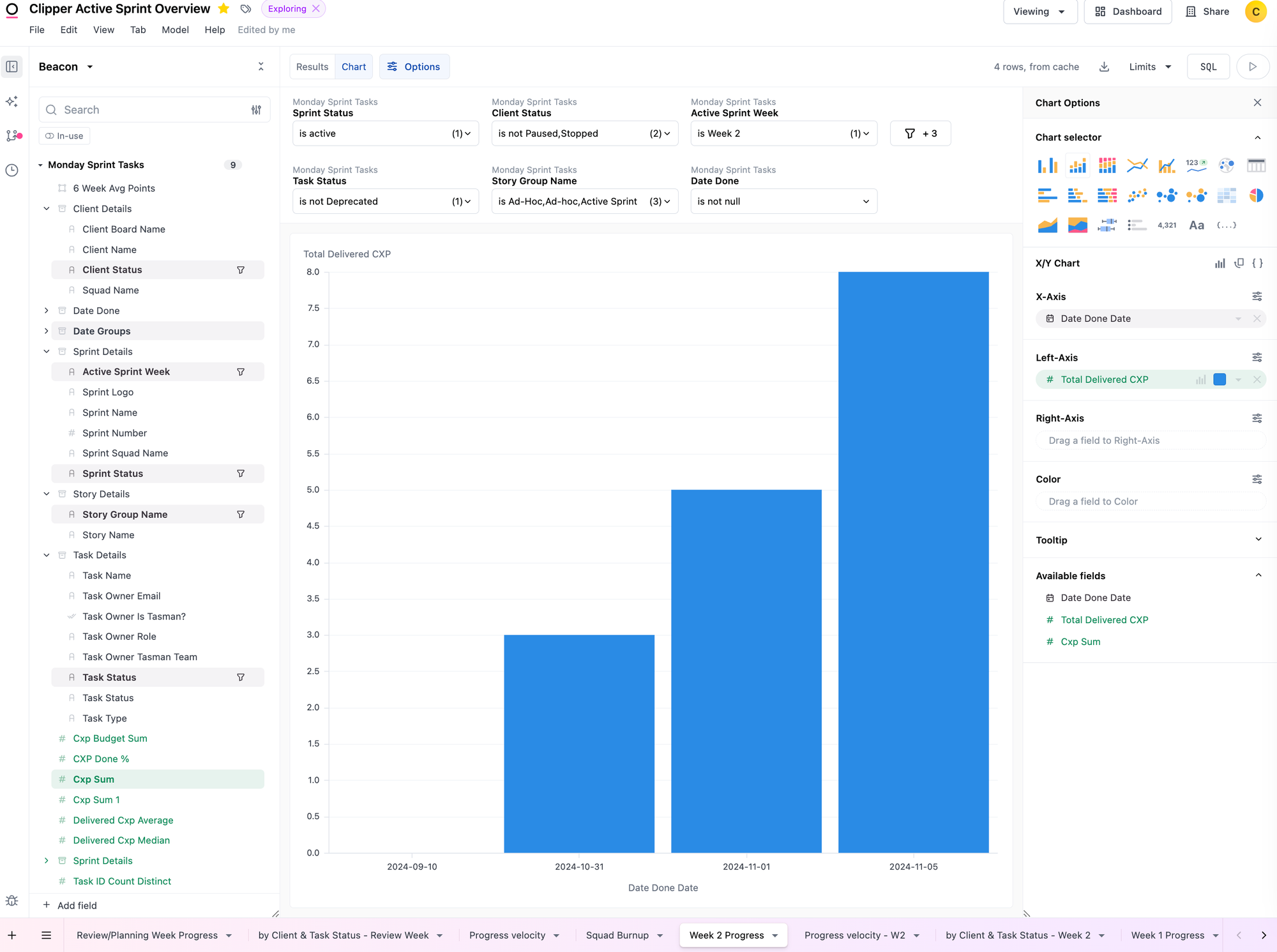
With the shared model in place, we kick off our analysis by creating a workbook. This is where the magic of exploratory analysis begins, allowing us to dive deep into the data and uncover insights. The workbook works as an spreadsheet or excel file, where each tab contains a query.
The workbook allows you multiple views of the results. Chart will default in the best visualisation option — the one that Omni thinks will work best for the question you’ve asked. Of course this can be easily changed within the options .
Omni has more than 20 viz types available, plus the ability to create your own custom one using VegaLite grammar.

Step 4: Crafting Dimensions and Measures
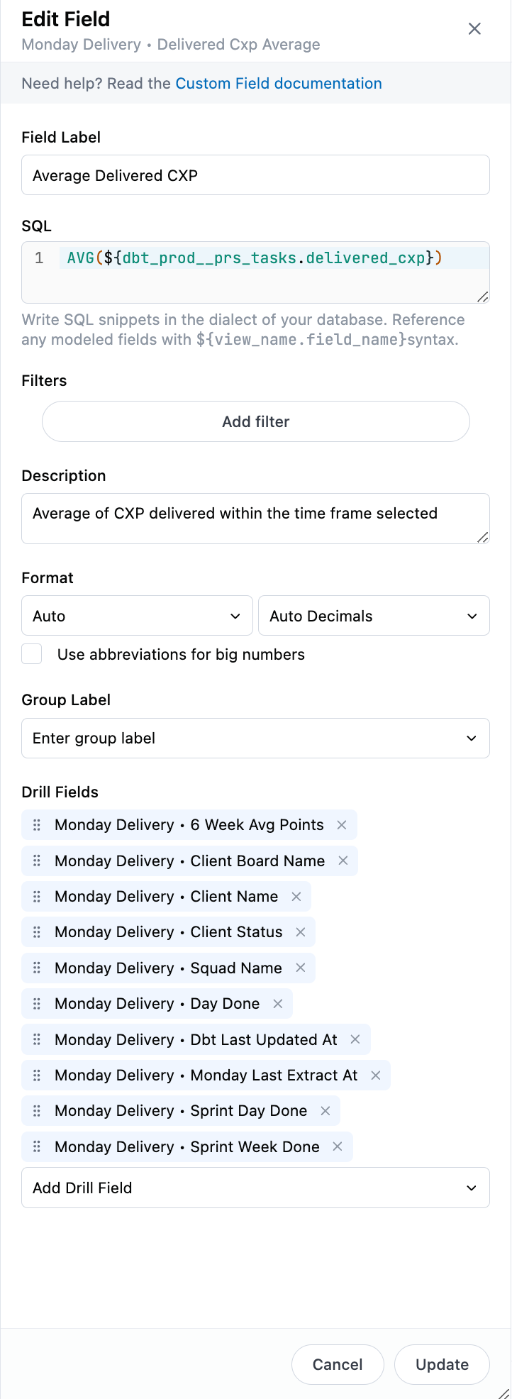
In this phase, we create custom dimensions and measures within the workbook. Omni’s flexibility really shines here. It allows us to use Excel-like formulas for complex calculations, or even sql measures. Once refined, these metrics can be promoted to the shared model if we think other people within the business will use them for their analysis.
SQL version:

Excel-like: Simply create a new column, add your excel formula by mentioning the cells you want to use, and voila! You can also change the name of the column. The key consideration here is that you can’t remove the columns that are being used to do the calculation. If you do, it will give you a polite error message.
If you want to promote excel-like metrics (so that they can be used in shared models or topics) you can! But be also aware that you’ll be promoting the underlying metrics as well.

Step 5: Refining in the IDE
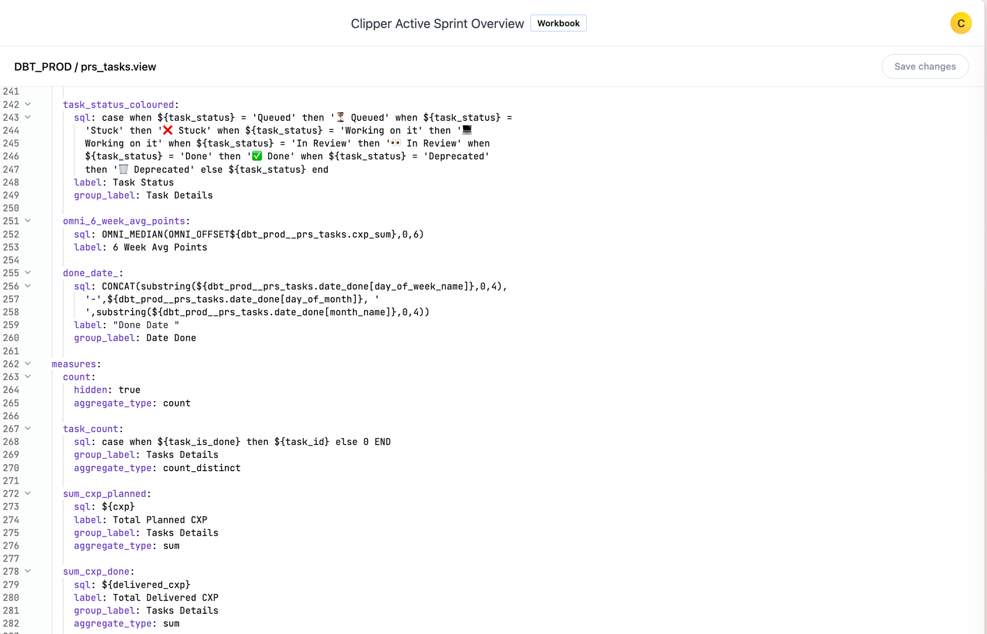
We then move to the IDE (Integrated Development Environment) feature to update and organise our work. This includes adding labels, definitions, and grouping related metrics for clarity and ease of use.
This is technically done in the view, which is your raw table.
These steps make the workbook more user-friendly, as you can guide the end user with group labels. For example, you can group all dates together and place them at the beginning or end of the list.

Step 6: Dashboard Creation
Finally, we bring it all together in a visually compelling dashboard. Omni’s rich visualisation options and interactive features allow us to create dashboards that are both informative and user-friendly.
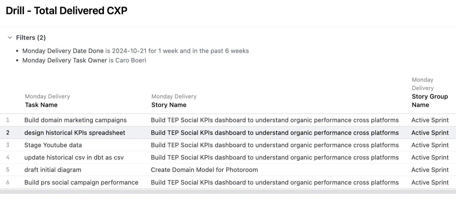
Each measure in each dashboard will have a drill-down field selection. This means that the end user can dig further into the visualisation. Usually these are the default, but you can add whatever you think its relevant when setting them up in the Workbook or IDE.

The Tasman Advantage: How we Leverage Omni’s Unique Features
Our approach maximises Omni’s strengths:
Version Control: We use Omni’s branching feature for collaborative development and quality control. Even though we haven’t mentioned it in the step by step, we have a github repo integrated in the platform. This is super useful not only for saving our Omni code, but also to extract the datasets we build in Omni into dbt for other usages.Semantic Modeling: The shared model ensures consistency across all analyses and dashboards. This consistency is key in cross-function analytics. We’ve heard way too many times that stakeholders talk aboutLeadsorSubscriptions– but that each team has a slightly different definition. No more. Omni’s Promotion of Metrics features and its governance around measures and dimensions do the trick to align stakeholders.Excel-like Formulas: This familiar syntax reduces the learning curve for a lot of teams out there – if they are used to build their own reports in Excel, they will be able to use Omni.Customisable Visualisations: We can easily create tailored, interactive dashboards that meet specific client needs.
Empowering Data-Driven Decision Making
It’s a great time to be in BI.
By adopting Omni and developing this robust framework, we’ve been able to really get better at delivering insightful, scalable, and maintainable BI reporting. Our approach not only accelerates dashboard development but also ensures that our exploratory analyses are thorough and actionable. This is quite the game changer.
As we continue to push the boundaries of what’s possible with Omni, we’re excited about the future of BI and the value we can bring to our clients. The journey from raw data to actionable insights has never been more streamlined, and we’re proud to be at the forefront of this revolution in data analytics! Onwards 🙂